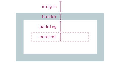
At the most basic,
a modern CSS ‘reset’
will often start with one of the following:
* { box-sizing: border-box; }
html { box-sizing: border-box; }
* { box-sizing: inherit; }
Each one has a variant
that includes *::before, *::after
along side the universal selector.
That’s because * itself only selects actual elements,
not pseudo-elements like ::before and ::after.
We’ll get to that,
but first let’s talk about
inheriting the box model.
Box properties should not inherit
While inheritance is a core concept in CSS,
only a small minority of properties ever do it.
Inheritance is part of the ‘defaulting’ process,
which determines what to do
when no value has been explicitly provided
for a given property on a given element.
Some properties,
like color and font revert to
the value used on the parent element.
They inherit the value.
But most of the properties we use –
background, border, margin, padding, display,
and so on –
revert instead to their initial value
defined in the specification.
There are more properties in each category,
but I think at this point
the distinction should be clear.
Some properties apply to the contents,
and those are the properties that inherit.
Other properties apply to the box,
and do not inherit.
Generally your instinct will tell you which is which.
If you add a random span somewhere in a line of text,
which properties would need to inherit
in order for that span to remain un-styled by default?
If the font-size or color of the text
reset to their initial values (medium and CanvasText),
that would be a noticeable change in styles.
But if a border and background were added
to match the parent box,
that would be even more noticeable!
See the Pen Inheritance intuition by @miriamsuzanne on CodePen.
There’s no good argument for inheritance
Of course,
we could still argue
that box-sizing is an outlier,
and should be one of the exceptions.
The argument I’ve seen
comes from way back when box-sizing
was first introduced –
and it was very specific to the transitional period
before box-sizing was widely used.
The claim is that
we might still have some legacy components
or third-party widgets on our site
that still rely on a content-box model.
By setting box-sizing to inherit,
we can change our box model on the widget container,
and it will apply to everything inside.
The assumption is that any component
will be designed using one box model or the other –
so we want to quickly toggle between them
for entire sub-sections of a web page.
And for a time,
that might have been a fair assumption.
But you can handle that case easily
without relying on inheritance:
* { box-sizing: border-box; }
.content-box-sizing, .content-box-sizing * {
box-sizing: content-box;
}
This isn’t more difficult than inheritance,
and it’s less code by default.
But more importantly,
that’s not the best use of box-sizing.
Box-sizing is more useful when it doesn’t inherit!
Contrary to popular belief,
there’s not a modern border-box model,
and a legacy content-box –
where sites/components can easily divide
between the two.
While the border-box model
is clearly a more useful default
in modern web design,
there are great reasons to use
content-box sizing
in modern layouts!
This may seem to be obvious,
but the content-box model is useful
when we care about the size of the content.
I find that most useful for wrapping containers.
When I’m setting a good line-length for text content,
I don’t actually care about the outer max-width of the border-box,
I care about the line-length available in the content-box.
Borders and padding should be additional,
rather than eating into the content.
This is often true with generated
::before and ::after content as well –
which is why I don’t generally change the default
on pseudo-elements.
I can handle it case-by-case, when needed.
The code-smell for switching box models
is any time we need a sizing calculation
that adds or removes the borders and padding:
.container {
padding: var(--padding);
width: calc(var(--line-length) + (var(--padding) * 2));
}
.container {
box-sizing: content-box;
padding: var(--padding);
width: var(--line-length);
}
When we’re using box-sizing in this way –
the way it was intended! –
inheritance would only get in the way.
I specifically want the ability to size containers
differently from the rest of the elements
inside the container.
This may not happen all the time
in your code,
but I’m confident the
legacy-component use-case is even less common –
and even simpler to handle on a case-by-case basis.
Please don’t inherit the box model.
It starts you off in the wrong mindset,
just to solve a problem that doesn’t really exist.


